
MIPS
Helping physicians navigate a complex reporting system.

Role
I led the end to end product design for the MIPS portal, working together with various stakeholders like subject matter experts (SMEs), product owner, UI developers, and backend engineering team. We built the MIPS portal to help physicians and medical practices report their practice data to CMS in a simple and painless process while ensuring they do not receive a penalty.
Impact
The simplified MIPS reporting portal allowed customers to submit physician and practice data for over 600 practices and more than 25000 physicians for the 2019 reporting year. The simplified interface resulted in 100% submissions, thus all our customers avoiding the CMS penalty.
What is MIPS?
CMS (Center for Medicare & Medicaid Services) is required by law to implement a quality payment incentive program, referred to as the Quality Payment Program, which rewards value and outcomes using a Merit-based Incentive Payment System (MIPS).
The existing process (in 2017) to submit reports was a lot of manual work for Program Managers at ArborMetrix, since there was no way for our customers to directly report to CMS. With the increase in the number of clients and the exponential increase in the amount of data, we needed a self-service approach. Our goal with the new MIPS Portal was to automate the review and submission process in an easy to use manner to aid the PMs.

Understanding the users
I worked with the Product Owner (and our MIPS SME), Melanie and our Program Managers to understand the different types of users, their goals, behaviors, and current pain-points.
Our goal was to make sure the portal was easy to use for new users but also familiar to existing ArborMetrix app users.
The personas we identified were -
Laura — A practice administrator
Larry — A solo physician
Jessica — A collaborative admin

Research insights
I partnered with the Operations & Customer Success team to observe customer support calls with new users trying to figure out MIPS.
We have two primary personas - Solo Physicians and Practice Administrators.
Users are often clueless about MIPS measures and scoring. They only know about the no penalty cut-off.
Lack of feedback confused users about successful completion.
Failure usually was from incorrect formatting of practice data.
Visualizing the problem
The Operations team and the Customer support team took lead into creating a customer journey map for our two primary personas - Laura and Larry. I worked with the teams to put together the customer journey map, and we set it up in the studio to help other stakeholders visualize and understand the different user pain-points.

🙌 Designing for ease of use
Our goal was to design for ease of use. We started with the information architecture and sketched out the possible user flow. We wanted to create a simple navigation model which is intuitive to new users while preserving the familiar navigation for existing users.
Starting with a box model
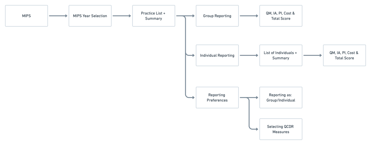
Persona based flows
The complete flows looks like but it was customized for each different type of user.

Iterative testing & improvements
We regularly tested our prototypes with proxy users (Program Managers and Product Analysts — people who closely worked with customers) as getting regular users (physicians and nurse practitioners) was not easy.

Design Decisions
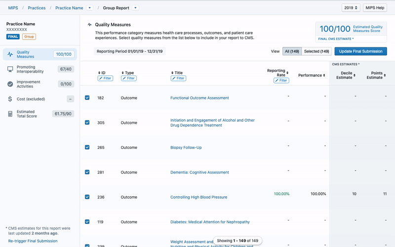
Full-width design
MIPS measures (like most healthcare measures) involved long descriptions and complex calculations which are important to understand to report. We added a full-width page template into our design system to create the best experience for this data dense application.

Interactions allow for easy switching
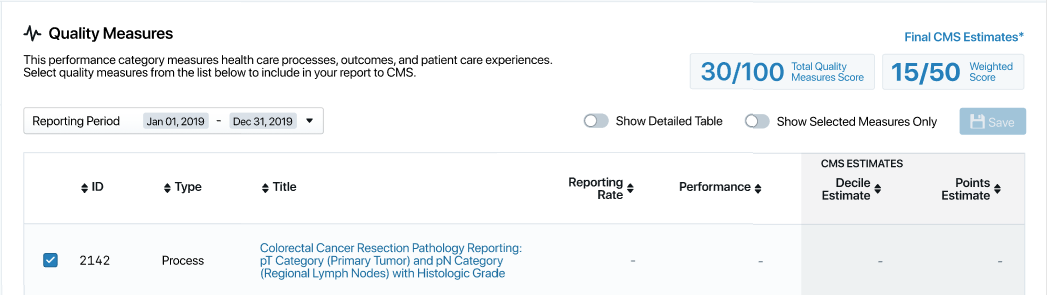
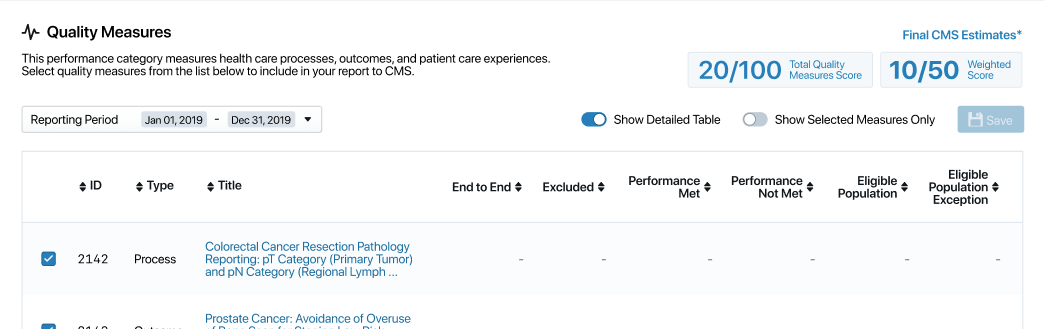
Our research indicated the need for a simple view and a detailed view. The simple view showed reporting rate, performance and deciles while a detailed view showed details like numerators, denominators, exclusions, etc. Our easy switching interaction between all measures and selected measures helped users quickly filter to relevant measures. Another toggle for Detailed & Simple View for advanced users helped find eligible populations and exclusions.
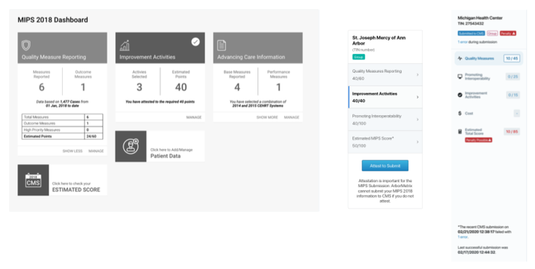
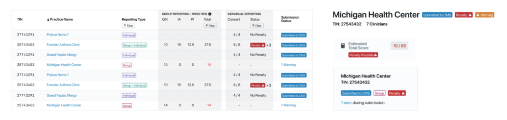
A central hub for all reporting stats
Users needed a central place to quickly glance over reporting performance for an entity. This design evolved from an initial dashboard style reporting page (explaining the different aspects of the reports) to an in-page left navigation element (the sidebar). The sidebar allowed users to quickly move between sections of their score - Quality Score, Improvement Activities, Promoting Interoperability, Cost and the Total Score Section. The elements also showed key information pieces like last submission details, any penalties, any warning and reporting level.
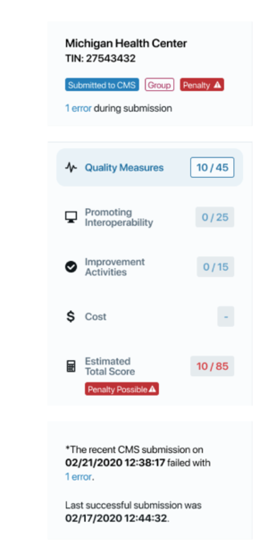
Reinforce important information with recurring tags
We used tags to highlight important information across the portal. Important tags like status messages (Submitted, Penalty, or Warning) were given visual prominence in order to catch the user’s attention, while other tags like Reporting Type (Individual, Group, etc.) were given lower prominence. We used the same tags across the portal to make it easy for the users to identify important information.
The final design
The final MIPS portal balanced the complexity of the medical submission data with the simplicity of design enabling our users to easily report on the MIPS measures. Having a live connection with the CMS API helped us quickly update possible scores* to give the users the maximum knowledge to make decisions on reporting for MIPS.
Designed for the users
Answer our user personas’ questions -
Laura knows who is getting the penalty and work with the individual to submit more data.
Larry knows whether he is getting a penalty or not.
Jessica knows which practice to help.

Final touches 🖌️
Nudging for best scores
In the Quality Reporting section of MIPS, we nudged users to submit all quality measures for a couple of reasons. One, this helped remove the uncertainty of selecting the six highest scoring measures, and, two, it helped create an open data set thereby promoting transparency.


Relevant information first
Measures were sorted based on the physician’s medical speciality to aid selection process (this helped physicians see relevant measures instead of sorting through all 280+ measures).
Reducing work, reducing errors
We automated the process of picking the PI (Promoting Interoperability) measures by directly integrating from the physician’s EHR data.

Learnings
While the MIPS 2018 portal was a major step in the way of automating and self-service, there were great critiques that we received from users. We have been moving forward, and making design improvements based on the feedback we received for the 2018 portal, and are hoping the 2019 MIPS portal will be an improved MIPS submission experience. Several improvements that we have made in the 2019 version is to show penalties in the list view, ability to ‘Not Report to CMS’, improved Estimated Total Score page, user friendlier text improvement and a few others.