
Expedia JustGo!
Helping people find the best travel package deals customized for them.

Impact
Role
Lead product design to create a proof of concept iPhone application which served customized travel packages for the user. The application towards young professionals and colleges students aimed to serve them customized packages based on their preferences.
The test audience loved the concept and the customized packages offered. It also significantly reduced package booking time from 24 seconds to 8 seconds. The application was very well received by the larger Expedia team, and they planned to scale the app for a mass market version.
Background
Expedia Inc. sponsored a project at the University of Michigan to discover new ways to engage users in their travel package booking process. I was part of the team to create a proof of concept (POC) application that would later be expanded by Expedia for a full-scale launch.
They were looking to answer the three most important question for booking travel:
When?
Where?
How Much?

Understanding the space

Advocating for a user centered design process, I led the team to conduct the initial need-finding research phase. We aimed to understand user pain-points, frustrations and their other needs from travel booking.
I wrote the interview protocol and we conducted 30 interviews.
I also designed a survey and rolled it out to around 500 people to validate the interview findings.
[*The surveys were slightly modified for each demographic (students and young professionals) to best understand them.]
🔍 Research findings
The most important factors when booking travel is Price, comparing deals, and, loyalty points respectively.
When people remember their trip experience they think of both the flight and the hotel experience.
Travel preferences vary with age.
The most common travel group size was two.
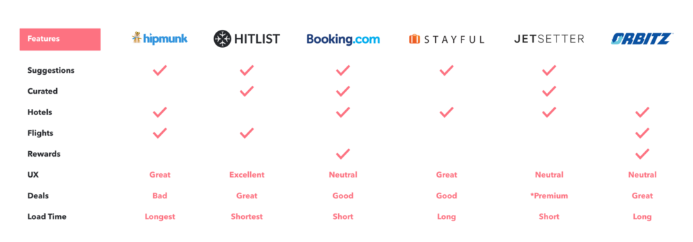
Competitive analysis
We looked at direct competitor apps as well as various analogous apps which were popular among our target demographic. This analysis helped us better understand the features required to create a robust MVP.
Design process
Understanding the competitive landscape I sketched out different interface possibilities drawing creative inputs from competing products. Next, in a critique session with the Expedia team I laid down the pros and cons of each approach. Our goal was to decide the design direction for the MVP.
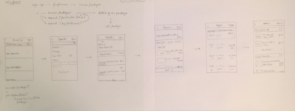
The critique session with Expedia leadership helped us shape our design direction -
How might we make the process of travel package booking as frictionless as possible?
Formative testing & improvements
Our first phase of testing was 6 rounds of hallway testing with the local student population in university buildings and coffee shops.
This helped identify critical improvements in the onboarding and package selection experience.

Improvement 1 - Onboarding Experience
1 - REDUCING THE NUMBER OF STEPS
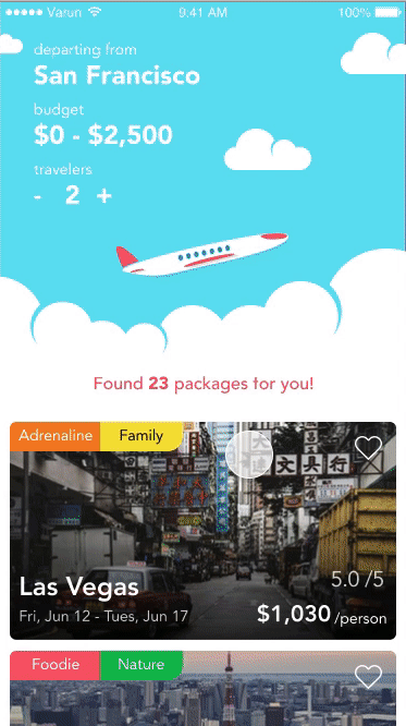
We initially decided to collect 3 important user attributes - Location, User Travel Preferences, and, Price Range. As we tested more, we pushed the price range to the package selection making the onboarding a simpler process.
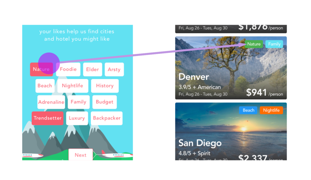
2 - USABLE USER PREFERENCE BUTTONS
Our initial user preference buttons were balloons (circular buttons) in accordance to our travel theme. But we deviated from our theme and opted for bigger rounded-square buttons for better usability as we found users struggled with circular buttons.
3 - MESSAGING TO BOOST UNDERSTANDING
Our initial loading screen after the onboarding was blank. We used the space to explain the load time by showing messaging like “looking for the cheapest flights”, and “finding the best cities” to explain the loading wait-time.
Improvement 2 - Package Selection
1 - QUICK PREVIEW OF TRIPS
We changed the design above the fold to have a quick summary of the hotel + flight combination. We changed this as we saw people having to scroll to find the flight details which was an important factor in their decision making.

2 - WHY AM I SEEING THESE TRIPS?
In some of our later tests with the actual iOS prototype app, we found that users were confused about some of the trips they were seeing. This made us bring out the tags on to the trip card to help people know this was something they selected.
3 - NOT EVERYONE LOVES BUDGET AIRLINES!
What I thought was an interesting find (back then) - some people really did not like budget airlines on their packages. As our target audience was students and young professionals we had created cheaper packages with budget airlines to get the best price. But after this finding, we started creating packages with other airlines (except in the case of ‘Budget’ and ‘Backpacker’ preferences).

Summative usability testing
Towards the end of the design phase, I conducted a formal usability test with 6 participants, followed by PSSUQ style usability questionnaire to quantify user happiness rating.
The PSSUQ results showed -
Scores near 2.2 (Agree) for System Quality, 2.8 (Somewhat agree) with Information Quality, and 2.3 (Agree) with Interface Quality. The lowest score we got was Somewhat disagree (4.8) for “This application has all the functions and capabilities I expect it to have.” which we attributed to the fact that it was an MVP application.
[While 6 participants would not yield statistically significant results, we were concerned with the general outlook of the application which we found was positive, with people asking us about the expanded version of the app.]

Finishing touches.
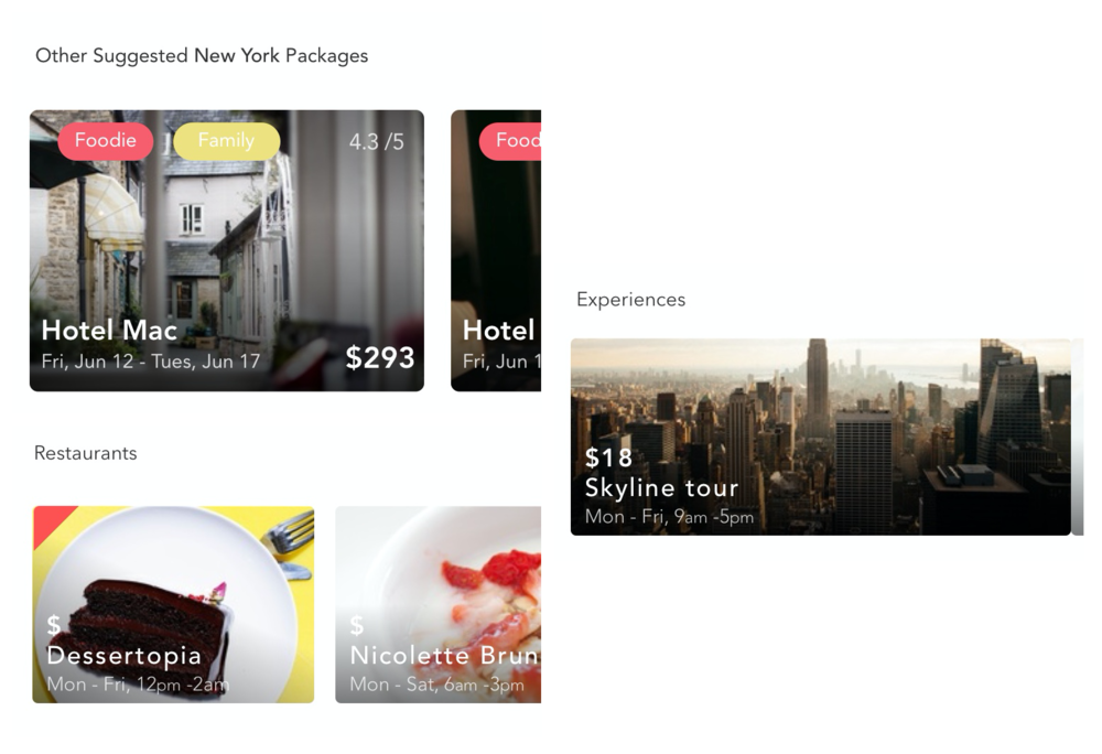
We wanted to add sprinkles on the cupcake before we handed the app off to Expedia. Since we had such a plethora of travel options available in Expedia, we decided to add the following to enrich the packages further -
Similar Packages
Experiences and Restaurants in the area
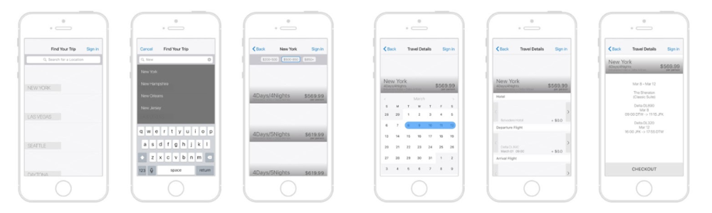
😍 Final package selection flow
Learning.
The entire process was a tremendous learning experience! I had great fun learning how to find people for hallway testing, engage people in hallway usability testing, manage a product from the start, and present to senior leadership.
A mistake we made was choosing a very specific target audience too early in the process. In our user testing, we found another segment of population loved the simplicity of the design. I improvised and made improvements to include their feedback in the final version.